Let’s face it: as a developer, I’m lazy. I just want to write just enough code. What is more, I want to reuse it whenever possible. I want it to be abstract.
If I’m asked to implement a view which needs a sortable grid, one of those whose rows you can sort by any column by clicking on it, I’ll either make use of any sortable grid widget available in the project’s UI framework of choice or build sorting functionality into a regular one. No matter the choice, I would end up with a grid widget that sorts strings lexicographically, dates chronologically and numbers… well, you get the idea.
Sounds reasonable, doesn’t it? Yes, it does… in general. In general means that statistically it IS the desired behavior, provided that we know nothing else about the context of use. If we don’t focus on the task we’re trying to help the user accomplish, if we don’t wear her shoes, we risk ending up happy with our reusable grid at the cost of making it less usable.
Let’s take a look at an example of a team which clearly cares for its users:

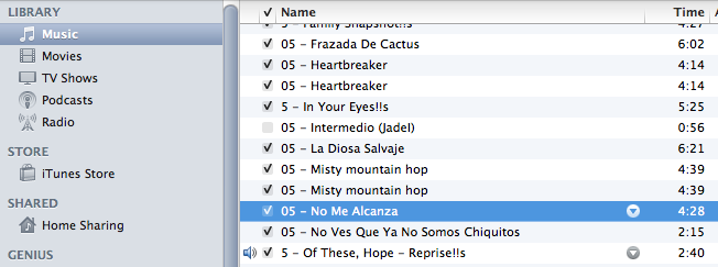
The grid in iTunes music library, sorted by song name
So, let’s see. Name is a string field, then we should sort it lexicographically… wait a minute! If it’s in lexicographical order why is it that “5 - In Your Eyes!!s” is placed between “05 - Heartbreaker” and “05 - Intermedio (JadeI)”? Because it makes sense in this context.
Odds are I don’t care whether the track number starts with zero or it doesn’t. By discarding the general approach to sorting strings, the iTunes’ team made its users’ experience a little bit more pleasant. And, at the end of the day, all those little details add up to make an overall satisfactory experience.
Now, if you ask me, at least when I sort my list by song name, I usually don’t even care about the track number and whichever other characters prefixing a song’s title. I would even ignore all those characters and start sorting by the first alphabetical character. But I can’t assure most iTunes users would agree with me. Maybe it’s a good example of a decision you would like to make based on the results of usability tests.
To sum up, if you’re a lazy developer like me, don’t let your appetite for abstraction and reuse leak into the user experience. Less is more, except sometimes when more is more!
