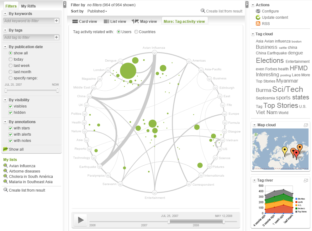
A couple of days ago we started working on a new visualization for Riff’s acitivity. The requirement was to find a way of representing the relationship between items tag with two or more tags, the users who were tagging and the evolution of the tags along time. With the help of our designer Luigi and Juan we crafted a nice visualization.

Explanation:
Tag Activity
Given a certain filter by any possible combination, we end up with a resulting set of items inside a Riff. Every tag belonging to any item in the resulting set is drawn around a circle. An arc is created between two tags, when there is an item that has both tags, the arc get thicker as the number of items with those two tags increases. Each user that has tagged an item in the resulting set is depicted in the visualization as a green circle, the greater the number of items he has tagged, the bigger the circle gets. The circle is positioned near the tags he has used the most. Below a timeline allows the introduction of the time as an additional dimension. So, basically the following information and patterns can be detected by this visualization:
- Hot set of tags: A thick group of arcs connecting 3 or 4 tags can indicate something particular going on with that subject, using ontologies or a Bayes Classifier we might be able to suggest related diseases.
- A bunch of users tagging a certain tag more than the average: If the color of the circle were the reputation of the user, you might find that a lot of well-known doctors are tagging a particular tag. As the stain around a tag gets bigger, a special consideration or care should be taken.
Hovering over a tag
Displays the summary of the related items, circles the users that had used that tag and highlights the tags used in conjunction with the highlighted one.
Hovering over an arc
Displays the amount of items with that pair of tags and also circles the users who used both tags.
Hovering over an user
Displays the amount of items that the user tagged and circles the tags he used.
